
 EN
EN
جابجایی از سفیدِ ساده
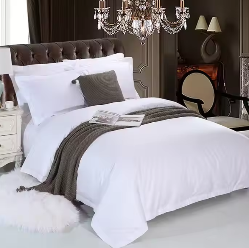
سالهاست که صنعت هتلداری به یک رنگ و فقط یک رنگ پایبند بوده است: سفید. ملافههای سفید، روپوشهای سفید، کاور بالشهای سفید. این ایده ساده بود: سفید ظاهری تمیز دارد، حس تازگی و شکوفایی میدهد و لوکسبودن را نشان میدهد. اما صادقانه بگوییم، این ظاهر کمی خستهکننده شده است. مسافران مدرن به دنبال چیزی متفاوت هستند. آنها میخواهند اتاق هتل برایشان مانند یک پناهگاه احساس شود، نه مانند بخشی از بیمارستان. بنابراین هتلها سرانجام در حال گسترش طیف رنگی خود هستند و با رنگهایی آزمایش میکنند که گرمی، شخصیت و حس مکانی خاصی را به فضای اتاق اضافه میکنند. این تغییر تنها برای پیروی از روندهای مد نیست. بلکه درباره ایجاد ارتباط عاطفی با مهمانان از لحظهای است که از در وارد میشوند.
رنگهای زمینی در حال اوجگیری هستند
اگر یک خانواده رنگ وجود داشته باشد که در این لحظه بهطور کامل صحنه پوششهای تخت هتلها را در دست گرفته باشد، آن رنگهای زمینی هستند. منظور ما قهوهایهای گرم، بژهای شنی، ترکوتاهای نرم و سبزهای زیتونی ملایم است. این رنگها فضای بیرون را به داخل میآورند و فضایی آرامبخش و پایهدار ایجاد میکنند که به مهمانان کمک میکند پس از یک روز طولانی سفر یا جلسات، استرس خود را کاهش دهند. به این فکر کنید: وقتی وارد اتاقی میشوید که پوششهای تخت آن در این رنگها باشد، بلافاصله احساس آرامش بیشتری میکنید. انگار اتاق در حال نوازش شماست. هتلها این مجموعههای پوششی زمینی را با مواد طبیعی مانند چوب، سنگ و مبلمان گیاهی (راتان) ترکیب میکنند تا ظاهری کامل ایجاد شود. این یک حس کلی است و مهمانان از آن لذت میبرند. زیبایی رنگهای زمینی این است که در تقریباً هر محیطی کار میکنند. یک اقامتگاه ساحلی میتواند از بژهای شنی برای بازتاب ساحل استفاده کند، درحالیکه یک اقامتگاه کوهستانی ممکن است رنگهای سبز جنگلی عمیقتری را انتخاب کند. تنوع این رنگها بینظیر است. و چون این رنگها بسیار خنثی هستند، با هیچگونه آثار هنری یا تزئیناتی که هتل از قبل دارد تضاد ندارند. این یک انتخاب امن است که همچنان تازه و مدرن به نظر میرسد.
آبیها و سبزها برای ایجاد اثر آرامبخش
آبی همیشه انتخاب محبوبی در صنعت مهمانداری بوده است، اما در حال تحول است. اکنون رنگهای آبی روشن و اولیه کمتر دیده میشوند و رنگهای آبی تیرهتر، خاکستری-آبی و فیروزهای کدر بیشتر مورد استفاده قرار میگیرند. این رنگها احساسات اعتماد، آرامش و پایداری را برانگیخته و دقیقاً همین حسی است که شما میخواهید مهمانانتان را در بر گیرد. سپس سبزها را داریم که اکنون بسیار محبوب شدهاند. سبز گیاهی، سبز اُکالیپتوس و حتی سبزهای تیرهتر جنگلی در مجموعههای پتوی هتلها در سراسر جهان دیده میشوند. رنگ سبز با طبیعت، تجدید و سلامت مرتبط است و بسیار آرامبخش چشم است. هتلها از این رنگها برای ایجاد فضایی شبیه اسپا در اتاق خواب استفاده میکنند. یک پتوی خاکستری-آبی را با ملاءمترین پارچههای سفید و برخی تزئینات چوبی گرم ترکیب کنید تا اتاقی بسازید که هم لوکس و هم دوستداشتنی به نظر برسد. این ترکیب علاوه بر ظاهر جذاب، در عکسها نیز بسیار خوب دیده میشود که در عصر اینستاگرام و نظرات آنلاین اهمیت زیادی دارد. مهمانان میخواهند عکسهایی از اتاقهای زیبای هتل را به اشتراک بگذارند و یک تخت با سبکبندی مناسب در رنگهای زیبای آبی یا سبز محتوایی بسیار قابل اشتراکگذاری است.
گرمترین رنگهای بیطرف و سفیدهای کرمی
اکنون بیایید دربارهٔ تکامل رنگ سفید صحبت کنیم. این رنگ ناپدید نشده، بلکه گرمتر شده است. به جای سفیدهای خشک و سرد، هتلها اکنون از سفیدهای کرمی، سفیدهای گرمِ کمی متفاوت و رنگهای نرمِ غلات جو استفاده میکنند. این رنگها تمامی پاکی و تمیزی سفید را دارند، اما با چرخشی آرامشبخش و دعوتکننده. احساسی بالینی یا بیمارستانی ندارند؛ بلکه حسی لوکس ایجاد میکنند. رنگهای خنثی گرم عالی هستند، زیرا نقش یک پایهٔ خالی را ایفا میکنند. میتوانید آنها را با بالشهای رنگی یا پتوی الگودار در انتهای تخت تزئین کنید. یا میتوانید آنها را به سبک مینیمال باقی بگذارید و اجازه دهید بافت پارچه صحبت کند. هتلهایی که این رویکرد را انتخاب میکنند، اغلب در مواد اولیهٔ باکیفیت با درخشش مناسب یا بافت ظریف سرمایهگذاری میکنند تا پتوها و بالشها تخت یا بیروح به نظر نرسند. نکتهٔ کلیدی در اینجا لایهبندی است. پایهٔ خنثی گرم به شما امکان میدهد با تنها و بافتهای مختلف بازی کنید، بدون اینکه فضای اتاق آشفته به نظر برسد. این سبک با ظرافت، بیزمان و همیشه گرانقیمت به نظر میرسد. و بیایید صادق باشیم: کدامیک از ما نمیخواهد تخت هتلیاش شبیه تختی باشد که قیمتی بسیار بالا دارد؟
رنگهای پررنگ تأکیدی و قطعات برجسته
اگرچه رنگهای خنثی ستون فقرات پتوهای مدرن هتلها هستند، اما رنگهای جسورانه در حال ایجاد تأثیر چشمگیری هستند. هتلها از رنگهای پرانرژی بهعنوان عناصر برجسته برای افزودن شخصیت و انرژی به اتاق استفاده میکنند. فکر کنید به بالشهای پرتابی زرد ماستاردی، پتوهای نارنجی سوخته یا حتی روپوش پتوی قهوهای-بنفش عمیق. این جهشهای رنگی معمولاً صرفاً برای عناصر تزئینی در نظر گرفته میشوند و نه برای کل مجموعه پتو. این روشی است برای القای شادی و هویت فردی بدون آنکه به طرح رنگی پرسر و صدا وابسته شوید که ممکن است برخی مهمانان را دور کند. نکته کلیدی این است که این رنگهای جسورانه را بهصورت محدود و با هدف مشخصی بهکار ببرید. یک بالش پرانرژی روی تختی با رنگهای خنثی میتواند ظاهر کامل اتاق را دگرگون کند. این کار توجه را جلب میکند و نقطه کانونی ایجاد مینماید. هتلها همچنین از رنگهای جسورانه برای بازتاب فرهنگ محلی یا محیط اطراف خود استفاده میکنند. یک هتل در مراکش ممکن است از رنگهای غنی قهوهای-خاکی و زرد زعفرانی بهره ببرد، درحالیکه یک اقامتگاه در کارائیب ممکن است رنگهای درخشان مرجانی یا فیروزهای را انتخاب کند. این روشی ظریف برای روایت داستان و ایجاد حس مکان در میان مهمانان است.
الگوها و بافتها دوباره در حال بازگشت هستند
رنگهای یکنواخت عالی هستند، اما پوششهای تخت ساده گاهی اوقات میتوانند کمی یکبعدی به نظر برسند. به همین دلیل است که امروزه الگوها و بافتهای بیشتری در مجموعههای پوشش تخت مدرن هتلها دیده میشوند. خطوط ظریف، الگوهای هندسی و حتی طرحهای گلی ملایم دوباره در فضای مهمانپذیری ظاهر شدهاند. اما نکته این است که این طرحها با سلیقه انجام شدهاند. منظورمان طرحهای پررنگ و شلوغی نیست که فضای اتاق را تحت فشار قرار دهند. بلکه منظورمان طرحهای آرامی است که بدون جلب توجه افراطی، علاقه بصری ایجاد میکنند. برای مثال، یک خطکشی باریک و ظریف با رنگی کمی متفاوت از رنگ اصلی، لایهای از ظرافت به محصول اضافه میکند. بافت نیز عامل مهم دیگری است. هتلها از پارچههایی با بافتها و پرداختهای متفاوت برای ایجاد عمق استفاده میکنند. یک پتوی بافتدار و ضخیم در انتهای تخت یا یک بالشتک با بافت خطی ظریف، میتواند پوشش تخت را لوکستر و جذابتر کند. همه اینها در راستای خلق تجربهای چندحسی است. وقتی مهمانان دستهای خود را روی پوشش تخت حرکت میدهند، باید کیفیت را احساس کنند. و وقتی به آن نگاه میکنند، باید چیزی زیبا و با طراحی دقیق ببینند.
سفت شدن و هویت برند
یکی از بزرگترین روندهای فعلی در زمینهٔ تختآرایی هتلها، سفارشیسازی است. هتلها متوجه شدهاند که تختآرایی آنها بخشی کلیدی از هویت برندشان محسوب میشود. این موضوع دیگر صرفاً مربوط به راحتی نیست؛ بلکه دربارهٔ ایجاد ظاهری هماهنگ و یادماندنی برای مهمانان است. در اینجا تأمینکنندگانی مانند JH Super وارد عمل میشوند. آنها با هتلها همکاری نزدیکی دارند تا پالتهای رنگی سفارشیسازیشدهای طراحی کنند که با چشمانداز کلی طراحی ملک همسو باشد. چه رنگ آبی خاصی با لوگوی هتل هماهنگ باشد و چه الگوی منحصربهفردی با فرهنگ محلی ارتباط داشته باشد، سفارشیسازی به هتلها این امکان را میدهد تا در بازاری شلوغ، متمایز شوند. و بیایید صادق باشیم: در صنعت مهماننوازی، متمایز شدن همهچیز است. مهمانان امروزه گزینههای بیشتری نسبت به گذشته دارند و به دنبال تجربههایی هستند که احساس منحصربهفردی و شخصی داشته باشند. هتلی که در تختآرایی سفارشی سرمایهگذاری میکند، پیامی را منتقل میکند: ما به هر جزئی از اقامت شما اهمیت میدهیم.
نتیجهٔ نهایی دربارهٔ رنگهای تختآرایی هتلها
پس نتیجهگیری چیست؟ لوازم خواب مدرن هتلها کاملاً بر پایه تعادل استوار است. این تعادل ترکیبی از جذابیت بیزمان رنگهای خنثی گرم و هیجانانگیز بودن لهجههای قوی است. این امر بهکارگیری رنگ برای ایجاد حسّی خاص، روایت داستانی و القای احساسی در میان مهمانان را شامل میشود. آیا اثر آرامبخش پتوی سبز گیاهی است یا فضای ظریف و باکلاس ست پتوی آبی سنگی، رنگهایی که برای لوازم خواب هتل انتخاب میکنید، اهمیت دارند. این رنگها بر ادراک مهمانان از برند شما و همچنین نحوه یادآوری آنها از اقامتشان تأثیر میگذارند. و در صنعتی که در آن اولین انطباعات از اهمیت بالایی برخوردارند، امکان اشتباه کردن وجود ندارد. بنابراین جرات آزمایشهای جدید را داشته باشید، با پالتهای مختلف کار کنید و از خروج از منطقه امن تمامسفیدی نترسید. مهمانانتان از این اقدام تشکر خواهند کرد.